

A float configuration deployment with flag on one of the deep saline units.
In March we did an experiment by adding small flags to some of our flow sensors to enhance their response in low flow situations. As with so many of the things we have tried on this project, these thin sheets of ABS were the best solution I could come up with that would (1) flat pack into our luggage and (2) be assembled in the field with zip-ties. One of my pet peeves with commercial equipment is that much of it fails the suitcase test, which can be an important part of trip logistics.
Now, I’m not even going to pretend I have the kind of skills it would take to estimate drag on those fins, which present a progressively smaller surface as tilt angle increases. In fact, I probably know less about math than I knew about electronics when I started this project. So everything that follows here is just me just muddling through like always. If you actually do possesses those skills you should probably look away now. I’d hate to be responsible for another academic drinking themselves into oblivion, while muttering about the internet being taken over by monkeys.
Without an expensive accoustic dopper unit to calibrate against, the best we could do was develop an empirical relationship between the new design and old ones. So we installed one of the “enhanced” flow sensors beside a similar unit with no flag. Comparing the two data sets would show us how much the flag was increasing the sensors response to water flow. Since we had no idea what that low end amplification would actually turn out to be, we used a tidally controlled coastal outflow that went from zero flow to peak velocities above 10 cm/s twice a day.
Fortunately, a good storm passed over the system right in the middle of the deployment: pushing that range even farther (probably to about 20 cm/s). Here is a small snippet of data covering that event:

My first impression was that the boosted diurnal response looks like the kind DRC plank that smacks you over the head whenever you turn on a radio these days. The low end is being boosted by a huge amount, in fact, just before the event there are some spikes in the flagged data there that don’t don’t even rise above the noise floor on the “naked” flow sensor. Just looking at those tells me we had between 3-4x more signal at the low end. But how do I quantify that?
I started with a plot of the two sensors against each other, which showed a sharp point of inflection: 
Note: Logger #012 had the drag enhancer attached, while C4 had no flag. The loggers bodies themselves presented very similar, somewhat spherical, profiles to the water flow. My newer builds are cylindrical, which opens another whole can of worms.
I was happy to see that the low end boost looking so linear and I wondered if that elbow was some kind of turbulent flow transition. Who knows, perhaps when the loggers approached sixty degrees the fin even starts to contribute some lift. (?) But in terms of relating one units response into the other, even I could see that Excel’s trend line was terrible. You can do better with the solver plug-in, but you have to know the equation you want to use first. If you don’t know what the formula is, it can be a tedious process to figure one out from scratch.
So I went looking for something that would give me a better way to model that relationship. That plot looked like a distorted “S” shape, and google image searching lead me to the entries on logistic functions of the form: f(x) = a / (1 + b c –x) These sigmoidal curves start out with a low slope, which increases to an inflection point, then levels off as they approach a maximum value. They pop up frequently in natural systems when people try to model population/cell growth, or EC50 dose response. The Gompertz function was a long-tail variant that also looked like a good contender.

First pass with Eureqa: meh!
While I was digging through all that, I came across references to a statistical modeler called Eureqa that was developed in Cornell’s creative machines lab a few years ago. I’d seen mention it before in the geek press, but this was the first time that I had a situation where it might be useful to me personally. So I downloaded their free trial version and day-am! This slick bit of code made me feel like a ten year old who’s been left alone in the cockpit of some large piece of earth moving equipment that still has the key in the ignition. Clearly this was a tool for real scientists, and I should probably wait for that adult supervision. But…well…I’ve been failing that kind of marshmallow test for quite a while now.
And I didn’t get much out of it at first, but after going over their tutorials I found it was fairly easy to change the generic y=f(x) starting point to any model you want. This lets you can derive arbitrary constants from a really disorganized lump of data without having to do all that grunt work in Excel. I did a couple of runs with the Logistic function, and with the Gompertz curve:
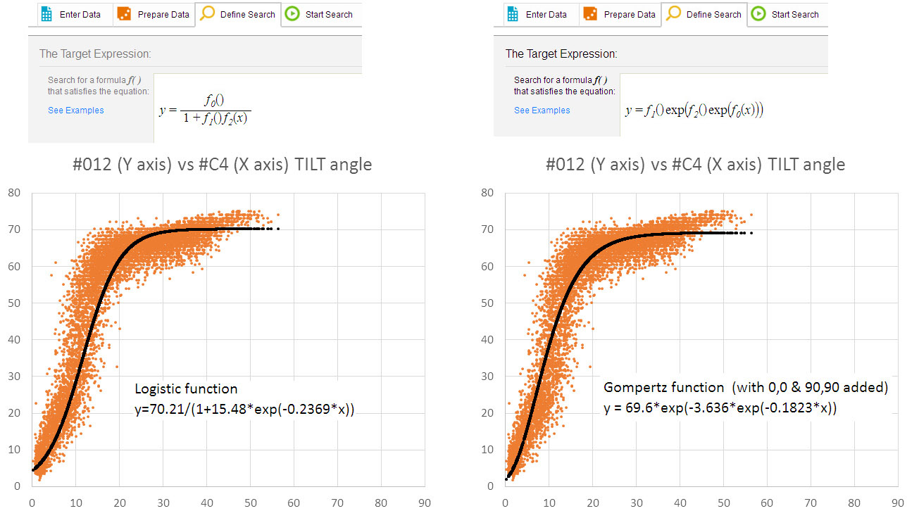
Note: the functions specified with empty brackets: f1(), f2() etc. force the solver to put a constant at that location
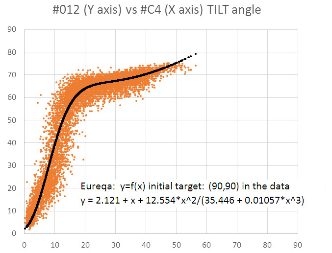
My raw data did not really have (0,0) point due to sensor mounting offsets, and the loggers never went beyond 75 degrees of deflection. But I found that by adding an arbitrary point at (90,90) I could move the upper asymptote away from that bulk at the top end of the plot. After seeing the improvement from that change, and after deleting a few outliers, I let Eureqa take another shot from the default y=f(x) starting point:
Turtles all the way down…
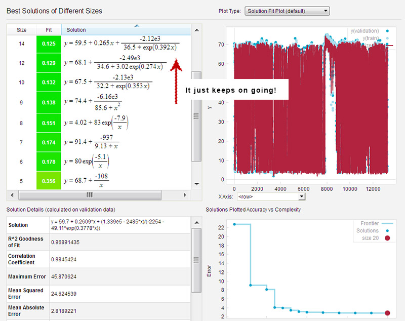
Now that’s starting to look better, and I was not selecting the very “best” solution according to their fit metrics. If you leave the solver running for a long time (say, while you go have dinner…) it just keeps chugging away, adding coefficients until you have something large and ugly. But I am sure that if I actually knew what I was doing, the correct solutions would jump right out at me. The press often overlooks this critical step with their hyperbole about Eureqa “replacing” scientists: the real world is not a simple pendulum: it’s a warm, squishy, mess that involves a lot of value judgment.
More electrons will give their lives as I burn through my 30 day trial. It’s too bad Nutonian wants $30/month for their cheapest license. If they went with the WordPress model (ie: $30 a year for the little guys) I’m sure every maker in the world would be using this software to sort out one-of-a-kind build issues like this. Of course, I’m not sure this exercise actually taught me anything about the physical phenomenon involved. But if blindly applying complex, statistically derived equations is good enough for Wall Street, then it’s good enough for me. What could possibly go wrong? 🙂
And…Happy Birthday to my brother Mike!
As a seasoned Linux system bender, he was one of the first people to bring the Arduino / Open Source Hardware phenomenon to my attention. And he is also someone who knows how absurd it is for me to post on anything mathematical.
